Data helps us understand the world around us. Knowingly and unknowingly, we produce and share vast amounts of it as we go about our daily lives. It is collected for purposes spanning from the commercial to the scientific, allowing us to chart patterns and uncover truths about ourselves, the world around us and how we interact. And, of course, everything in between. Data offers insight into things that aren't immediately visible. But where a spreadsheet or chain of raw digital material may come across as dry and academic, images have the power to communicate on a broader and more immediate level.
The medium of data visualisation in art has blurred the boundaries between art and science, sparking a phenomenon in which both artists and scientists use innovative data visualisation techniques to find new, impactful ways to communicate scientific research.
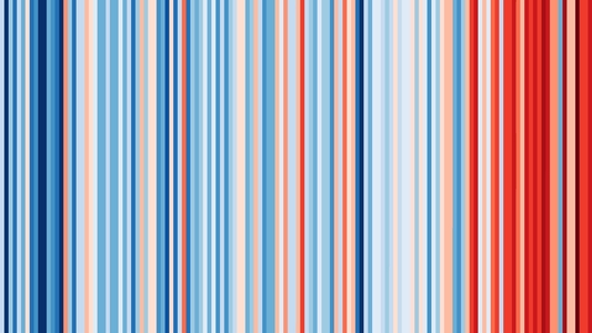
For climate scientist Professor Ed Hawkins (National Centre for Atmospheric Science, University of Reading), starting conversations about climate change was the driving motivation behind his development of the Climate Stripes, a simple pattern of coloured stripes generated by the latest scientific data that represents the increase in temperatures since 1850, one stripe per year, with dark blues used for colder years, and dark reds for warmer years. The incremental march towards higher global temperatures, accelerating rapidly in recent years, can be appreciated at a single glance. Already a familiar image to many, the stripes have become a global phenomenon.
However, Hawkins' first edition of the stripes, Climate Stripes: Warming Stripes (2017) presented climate data for a very specific place and purpose – the Hay-on-Wye Festival in 2018. That year the festival had decided to promote environmental issues, and so they invited three environmental scientists to partner with three artists to put on three events at the festival. Partnered with the poet and author Nicola Davies, who wrote some poems about climate science, Hawkins talked about the data itself. As he explained to me: 'people were mainly there for a literature festival, so I wanted to try and make things, at least at the start, as simple as possible.'
Climate Stripes: Warming Stripes, Hay-on-Wye, 2017
2018
Ed Hawkins 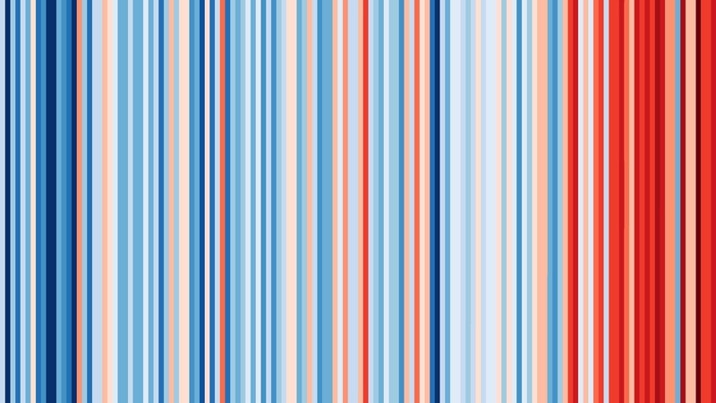
Hawkins continued to explain: 'The idea just to use coloured stripes – to represent the yearly temperature data – seemed like a natural choice. It had existed previously (I certainly didn't invent it). But there's been a whole community of people knitting scarves to represent climate data for decades – no one had quite put this together with computer-generated graphics. As with everything, you're always building on the shoulders of others and the Stripes are very much in that vein.'
Testament to its striking power, the image Hawkins tweeted of the stripes was picked up by the American meteorologist and CBS weather presenter Jeff Berardelli. He printed the stripes on a tie and encouraged other broadcast meteorologists to wear a piece of clothing featuring the stripes for the #metsunite initiative on 21st June, the Summer Solstice, in 2018 in an effort to encourage public conversation about climate change. The hashtags #metsunite soon became the annual Show Your Stripes event which takes place on the Summer Solstice each year.
Jeff Berardelli wearing the warming-stripes graphic 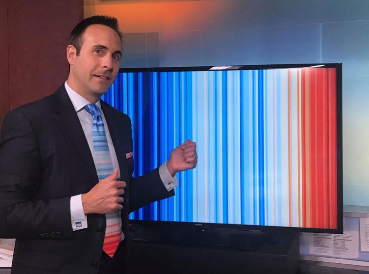
Hawkins released the image on Creative Commons (CC) licence which allows everyone to share, copy, remix, transform, and build upon the stripes for any purpose. Via the #showyourstripes website graphics of the stripes can now be freely downloaded for around 200 countries and US states, as well as for the world as a whole:
'It's essentially done so that people can use it. This is not about making money, this is about spreading information and communication and starting conversations about climate change because we all need to talk about it more if we're going to solve the problems. The only way to do that is to make it freely available for anyone to use the way they want. It was a no-brainer. People have found it useful, therefore we need to make it accessible so that people can use it in multiple different ways. It's been fantastic to see how people have used it, taken the concept and run with it.'
On the art-science debate, it is the context in which the work is encountered that is critical for Hawkins:
'I would call it a data visualisation, but other people might see it differently. As soon as people start painting it on walls and fences, it naturally becomes an artwork.
'There was a student in Germany that put on a show in Berlin where they built this series of light bulbs and put it in a very prominent market square in Berlin where it was all lit up and showed the stipes. Someone else did a similar thing in Denmark, using light and projection of the graphics onto buildings. People have decorated their cars in the stripes, the first one I saw was a Tesla, an American paid for a special company to paint his Tesla with the stripes. Those are some of the early examples.
'[The Stripes] have also been on the front cover of The Economist, which is obviously a very widely seen publication. They've been used by rock bands as backdrops for their gigs, which has been amazing. They've been used as placards at climate protests around the world. Recently, they were used at London Fashion Week and also at Chelsea Flower show this year.'
Climate change touches everything The Economist reports on. It must be tackled urgently. There is no alternative. Our special issue this week https://t.co/QtI6xgrpWR pic.twitter.com/2JYOQ58jpz
— The Economist (@TheEconomist) September 19, 2019
It was following in this spirit of openness and perpetual repurposing that the University of Reading Art Collection accessioned two editions of the stripes as digital artworks, which can now be viewed together on Art UK.
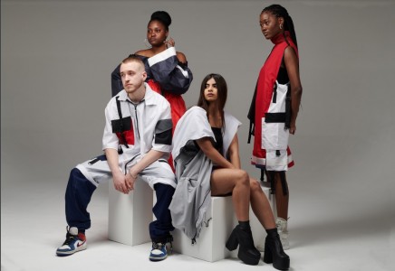
The work from 2020 represents the most up-to-date global version of the stripes, including data up to the end of 2020 (an exceptional year in so many respects). It is widely used in connection to the University's current work around climate education and COP26, when Hawkins will speak at the pre-COP gala event alongside a performance by singer Emeli Sandé (who will wear a bespoke Tammam climate stripes dress).
Ed Hawkins and Emeli Sandé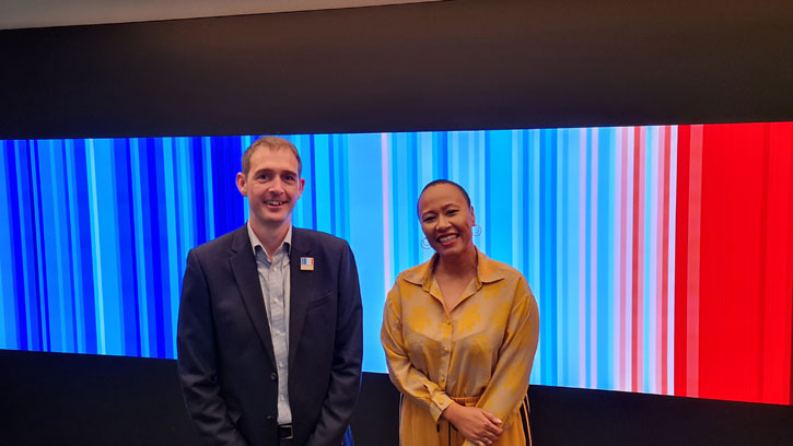
The dark red lines that appear at the right-hand side of the image also underline a stark truth. As Hawkins notes, whatever their context, the fundamental purpose of the stripes has never changed: 'while the Climate Stripes have now been used across the world by millions of different people and organisations, their purpose remains almost identical to when I first created them – to spark conversations about our warming planet.'
'I hope their inclusion in the University's art collection will help us to continue such conversations for as long as they are required.'
Naomi Lebens, art historian and curator at the University of Reading Art Collection
#ShowYourStripes merchandise created by Heritage Label is exclusively sold on the Art UK Shop.
Proceeds from sales of this range will support the University of Reading's work in climate change research and education, and the work of its museums and collections.

