At Art UK, usually we're concerned about the paint on a canvas, but have you ever thought about the paint on the walls behind the art? Here we talk to Patrick O'Donnell, International Brand Ambassador for luxury paint company Farrow & Ball.
What does your role at Farrow & Ball involve?
I am Farrow & Ball's International Brand Ambassador, primarily working with interior designers in the UK and USA.
Patrick O'Donnell, International Brand Ambassador for Farrow & Ball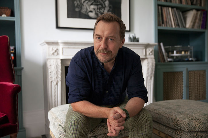
Building advocacy within the design community and acting as a conduit to help interior decorators to specify and understand the nuances of our palette. I also deliver talks on colour and design across the world including Russia and continental Europe.
We loved Farrow & Ball's collaboration with the Natural History Museum. Can you tell us a bit more about that project?
I'm glad you liked it – we were all thrilled with the end results and the reaction has been amazing. We were approached by the Natural History Museum and given access to Werner's Nomenclature of Colours. It immediately felt like a natural fit, especially the names which have that idiosyncratic Farrow & Ball feel.
Two Sisters (Mother and Daughter)
1899, oil on panel by Bessie MacNicol (1869–1904) 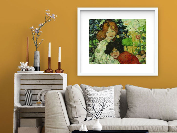
It also allowed us to venture outside of the perceived Farrow & Ball palette with some bright jewel tones such as Dutch Orange and Emerald Green.
Farm, Llanddona
c.1958, oil on canvas by Kyffin Williams (1918–2006) 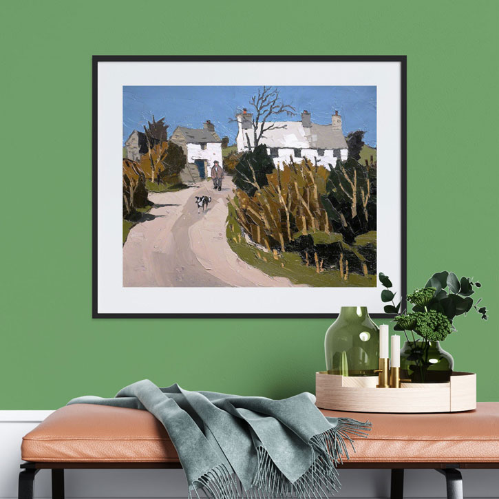
Do you work with other museums or galleries?
We do and we have. We have just been used through the galleries at MoMA in New York and currently we are being used in the overhaul of the British Galleries at The Met in New York too. We have also worked with galleries such as Dulwich Picture Gallery and Manchester Art Gallery and others across Europe such as Versailles.
What's your personal approach to selecting paint – do you have a go-to colour?
I'm rather a creature of habit and always drawn to slightly more muted tones. If my arm was twisted, Light Blue is a colour I constantly work with.
Snow
c.1937, oil on panel by Mabel Alington Royds (1874–1941) 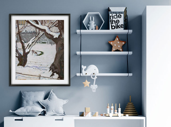
I also have an affinity with brown shades from the green-toned Mouse's Back to our latest brown, Broccoli Brown – so elegant and restful. American decorators are masters of brown-painted rooms. The key thing for me is to never follow trends and always follow your heart – remember, it's your home and you want to feel familiar within it.
The Art UK Shop offers a wide range of prints to help people bring art into their home. Do you have a favourite art movement or theme that you look to for inspiration when choosing colours?
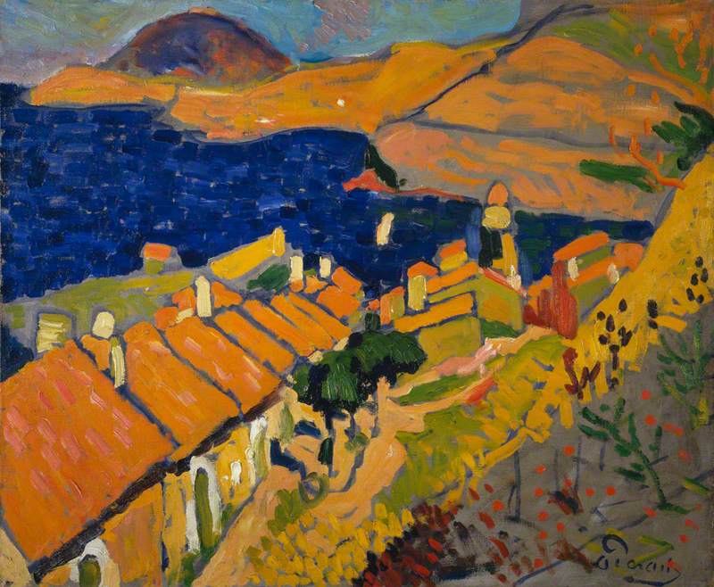
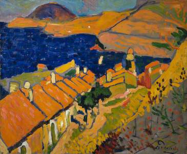
I'm a huge fan of Fauvism but I couldn't live in a home decorated in a 'Fauve' palette, I would never settle.
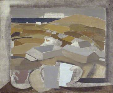
One of my favourite painters is Ben Nicholson, his abstract compositions are perfect and after his move to St Ives, the landscapes are just perfect (and the palette has that lovely muddy tone I always return to).
1946 (window in Cornwall)
1946
Ben Nicholson (1894–1982) 
What's your favourite print on the Art UK Shop?
You have one of my favourite paintings by Francis Cadell, The Black Hat.
The Black Hat
1914, oil on canvas by Francis Campbell Boileau Cadell (1883–1937) 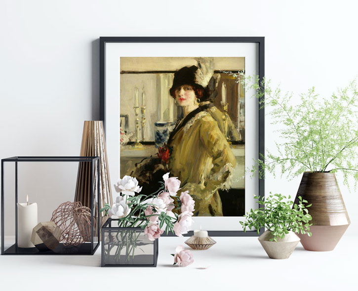
I'm a big fan of the Scottish Colourists and this painting just oozes classic Edwardian portraiture and with that lovely, loose brush stroke – just heaven! Can I have the real thing please?
Are there any places you've visited that have inspired your approach to colour or interior design?
Constantly! I'm really lucky with my job that I get to travel all over so I'm forever absorbing colour, local vernacular and art, but we are very lucky in the UK to have such a strong interior design culture.
From the great practice of Sibyl Colefax & John Fowler, (a brilliant colourist and constant inspiration – and the source of quite a few of our colours), to the present day with a truly burgeoning interior decorating scene.
The Pimlico Road in London is where I get my regular fix of all things beautiful these days, such a wonderful street with a great mix of showrooms to fire the imagination.
What do you think are the top three colour trends for 2020?
We are still seeing green everywhere. It's such a versatile palette and is ultimately a very restful, calm palette, even at the deeper end of the spectrum.
Flowers and Foliage
c.1880–1912, oil on panel by Caroline Emily Gray Hill (1843–1924) 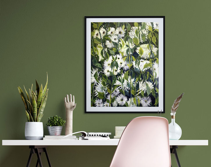
So much so that our colours for 2020 are Duck Green and Sap Green, from our collaboration with the Natural History Museum. Also, I love the paler brown/pink of Setting Plaster, an incredibly versatile colour that pretty much works with everything. Beige is back too – hurrah! Forget boring, beige tones offer a perfect backdrop to anything and add a gentle warmth to any interior, so great for those north-facing spaces.
York Street Leading to Charles Street, Manchester
1913, oil on linen by Adolphe Valette (1876–1942) 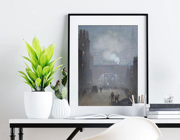
What tips do you have for people looking for a new artwork to complement a freshly painted wall?
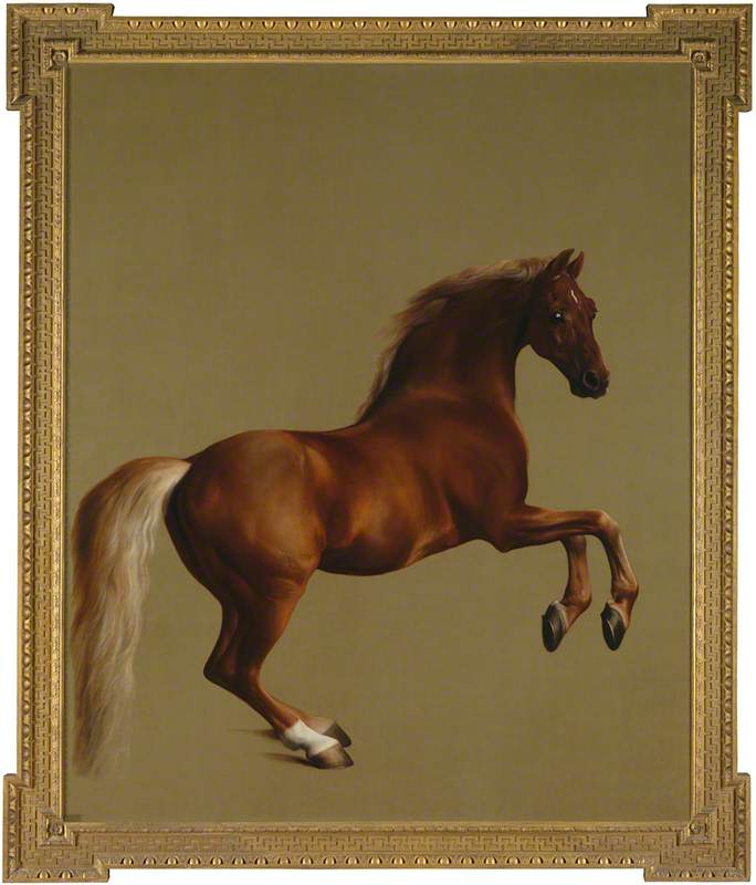
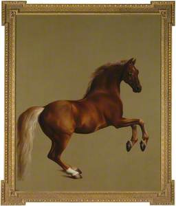
Don't buy art that matches your room scheme, that is such a depressing thought! Art should be personal to you, something that provokes thought or takes you on a journey. Or in its purest sense, something of aesthetic perfection that you could just stare at all day, that's the measure of a great painting. I'm thinking especially of Stubbs's masterpiece at The National Gallery, Whistlejacket.
I could stare at this painting all day, every day. The power, the composition, just ticks every sensory box.
Patrick O'Donnell, International Brand Ambassador, Farrow & Ball
