A past BBC report on Your Paintings (the previous incarnation of Art UK) featured a quote from a member of the public, which has stuck with me: 'art isn't a regular part of my life – BBC is'. This was the challenge we faced moving away from a BBC-hosted site: how do we make Art UK part of people's 'regular lives'? In terms of content, we knew that our partnership with the BBC would remain and we could still rely on them to bring in traffic, but in terms of technology, we needed to make sure that the new site was as user-friendly and enjoyable as possible.
The aim of Art UK has always been to make sure we retain the BBC audience, whilst simultaneously broadening our audience even further. This meant that when carrying out user testing we knew we had to talk to existing Your Paintings users, plus those who had never used Your Paintings before.
Concept user testing
In August 2015 we invited a sample of Your Paintings users to help us concept test Art UK. This proved valuable, as we got initial thoughts on messaging that influenced the structure and design. For example, the word 'categories' was felt to be too austere, so we came to the conclusion to use the word 'topic'. Also we found that the phrase 'famous artists' was controversial, so this was amended to 'popular artists'.
One of the main requests from collections for the new site was to encourage people to go and visit the works of art, and luckily 78% of those we spoke to in the groups felt that the site was designed with this in mind. Overall it was a thoroughly useful day and helped us to shape the beta version of the site.
City Interaction Lab usability testing
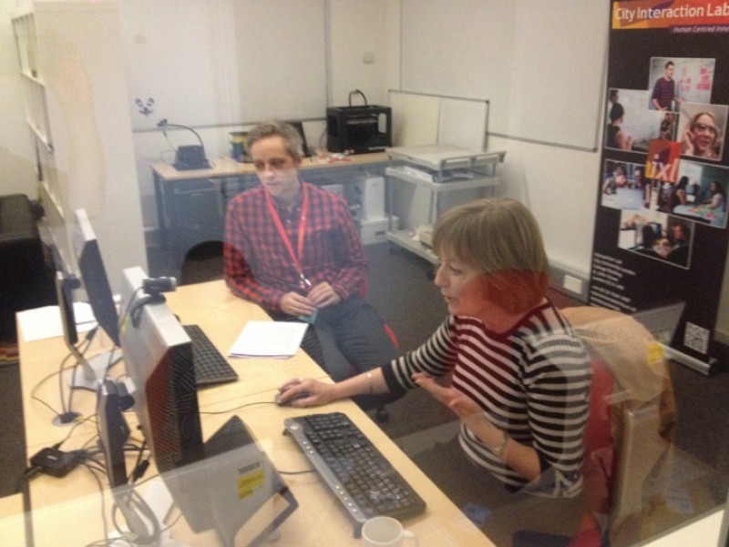
The next stage for us was to test Art UK in a controlled environment. We held two days of usability testing in December 2015 at the Interaction Lab at City University. The lab primarily allows MSc students at the Centre for Human Computer Interaction Design to gain experience working on commercial projects.
Some of the Art UK team observing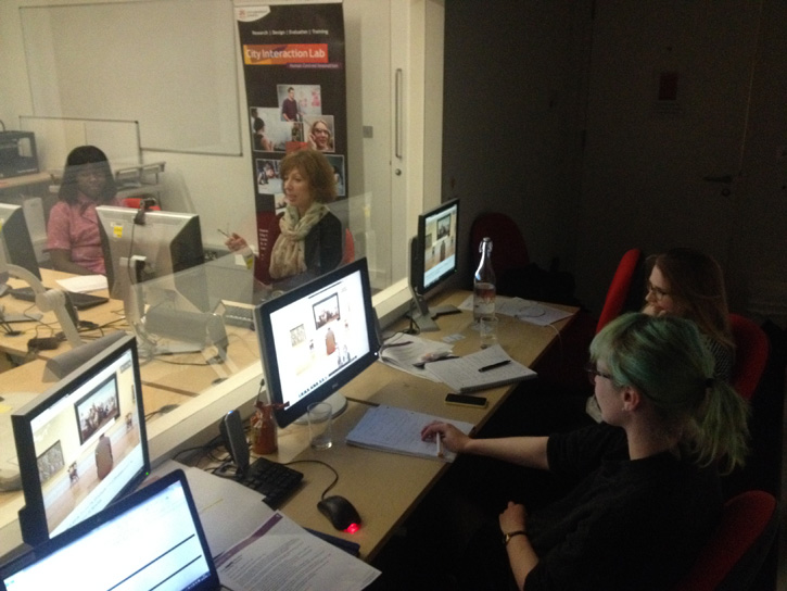
Members of the public were invited to test an early version of the website, including art enthusiasts along with those who had little interest in art and limited knowledge of Your Paintings. We were able to watch the users through a one-way mirror, watch their facial reactions through a camera, and watch their mouse movements on a linked up screen. It was a very surreal experience!
The grey line on the screen is the user's mouse movements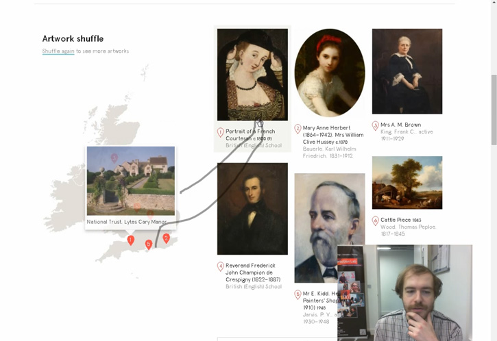
Each person's approach to using the site was so different from the next. From a florist who had little experience of using the web to a business analyst who was well versed in web testing, we saw a multitude of behaviours that we could not have possibly predicted, proving how useful it is to conduct usability testing.
Map view of the artwork search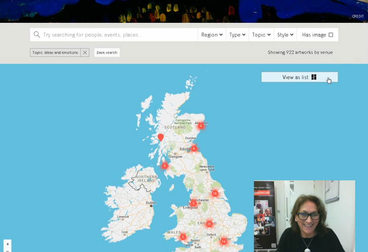
At the end of the testing, the team at City University provided a report. The first paragraph in the report was very positive:
'All 10 participants were overwhelmingly positive about the website and thought they might use it – including those participants who confessed to having little interest in art. There were no severe problems reported.'
Someone found the menu!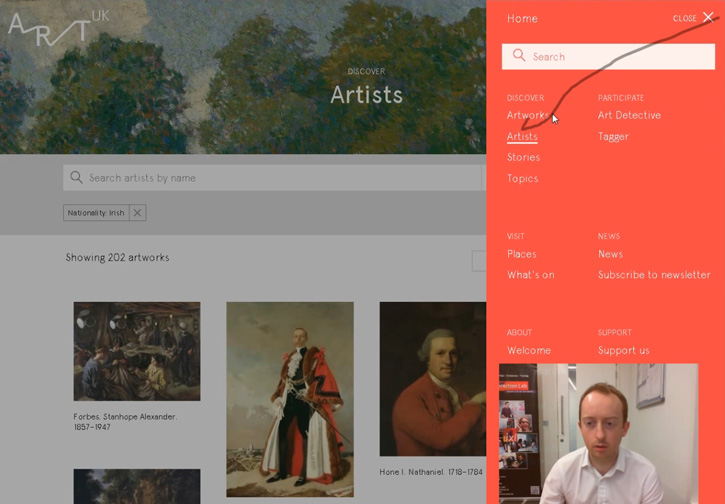
Some key findings were:
- Users liked the autocomplete feature. We then added autocomplete in more places on the site
- A lightbox feature confused users, so we removed it
- Some users did not see the menu in the top-right corner. The menu now moves down the page as you scroll
We built this website for the public to explore the public art collection, so if the public couldn't use it we would have failed our mission. If you have any feedback on the functionality of the site, please feel free to email editorial@artuk.org
Alice Read, Art UK
Please note: All those who took part were given a free catalogue and given access to a limitless stream of tea and biscuits.
