Download and subscribe on Apple Podcasts, Stitcher or TuneIn
Art Matters is the podcast that brings together popular culture and art history, hosted by Ferren Gipson.
Alight here for an exploration of poster designs for the world's first underground passenger railway. Posters in the London Transport Museum span over 100 years and represent artists employing a variety of different styles and techniques. In addition to their collection of original artworks, the museum holds around 30,000 posters representing over 5,000 designs. Since the early twentieth century, London Underground has been a design-conscious brand, and the catalyst for this focus on design was initially down to the efforts of Frank Pick, who joined the London Underground in 1906.
'Despite not having a background in art and design, he saw the opportunity to use pictorial posters as an important means of expanding the number of passengers,' says Matt Brosnan, Head Curator at the London Transport Museum. 'Frank Pick identified posters as a really good way of both advertising the system, and also [achieving] the lofty ambition of making sure that the network was decorated and supplemented with the best of art and design at the time.'
Golders Green
1908, poster by unknown artist 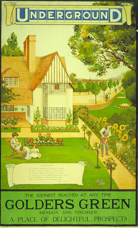
In order to increase travel during off-peak hours, Pick commissioned posters to promote the green areas surrounding London that could be reached by Tube and bus. The first poster he commissioned was a promotion for Golders Green station, which had been added to the network the year before. Rather than emphasising the service and trains, artists developed posters that tempted travellers with interesting attractions and locations worth visiting. They give the impression of a bustling city with everything to offer, from the green spaces at Kew Gardens to the shows and shopping in the West End.
Metro-Land
1926, poster by Michael Reilly 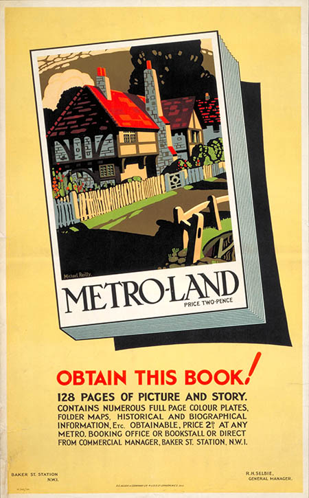
During the interwar years, the posters also encouraged Londoners to consider living slightly further out from the city centre. 'Quite a lot of posters of that period relate to the suburban expansion of London and the idea of commuting', Matt says. 'In the 1920s with the Metropolitan Railway, which is part of the Tube network, the Metropolitan Railway Company owned a lot of land in northwest London, and dubbed the term "Metro-land" as a way of promoting that suburban corner of London as a good place to live.'
In 1926, the Metropolitan Railway even developed a 128-page book promoting Metro-land, filled with illustrations, maps, and historical information about the area. A poster advertising the book includes an illustration by landscape artist and designer Michael Reilly, who exhibited at the Royal Academy between 1934 and 1940, and has works in Leeds and Dudley art galleries.
The Proud City; St Paul's Cathedral
poster, 1944 by Walter Ernest Spradbery (1889–1969) 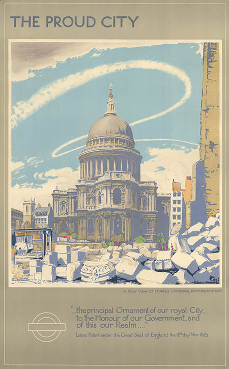
During the war years, the messaging of London Transport posters changed, and they were sometimes used to promote the war effort and even to recruit armed forces. In one 1944 commission for a series of six called 'The Proud City', each poster highlighted landmark buildings that had been affected by the war. In the foreground of the St Paul's image, artist Walter Ernest Spradbery depicts piles of large stonework from a shelled building, while St Paul's stands proudly intact in the distance. Spradbery was a trained artist and art teacher who designed posters for British Rail as well as the London Underground. He also served as an official war artist during the First World War, and some of his watercolour paintings can be found in the Wellcome Collection.
'In the blackout, to hail a bus or tram shine your torch onto your hand'
1943, poster by Zero (Hans Schleger) (1898–1976) 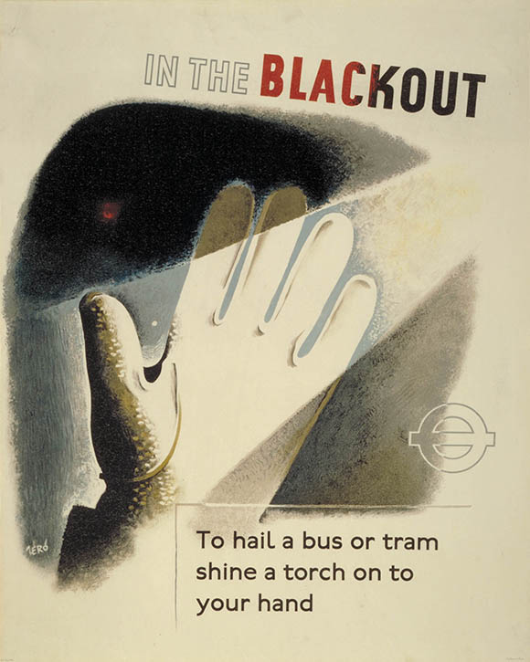
Further to these images, which were intended to raise morale, it was also necessary to produce posters with practical messaging to help passengers move about during difficult times.
'Posters talk about blackout conditions during air raids and the practical arrangements of that. [Things such as] carrying a torch and carrying white gloves to be able to hail down a bus safely in blackout conditions', Matt says.
By Underground to Fresh Air
1915, poster by Maxwell Ashby Armfield (1881–1972) 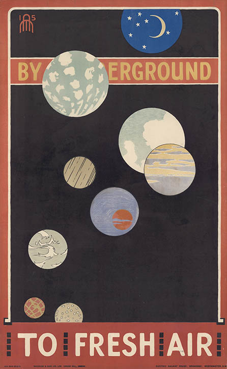
Some of the cutting-edge artists that worked with London Transport have paintings that can be found in museums and galleries around the UK. In 1915, Arts and Crafts movement artist Maxwell Armfield designed a stunning poster inspired by planets in the night sky. His paintings can be found in the collections of Tate, Russell-Cotes Art Gallery & Museum, Birmingham Museums Trust, and others.
Hans Schleger, who worked under the pseudonym Zero, designed mysterious, shadowy posters in keeping with his Surrealist fine art work (see the In the blackout... poster above). One of his paintings, called Journalists Use Shell, can be found in the National Trust collection.
London Transport
1938, poster by Man Ray (1890–1976) 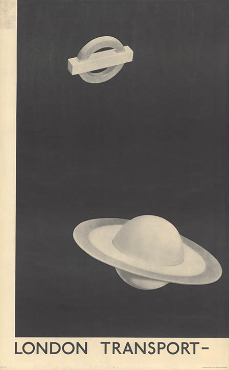
One popular design in the collection is a 1938 poster by noted Surrealist Man Ray. It is a grayscale image showing the London Underground logo alongside Saturn with the message, 'London Transport Keeps London Going'.
'It's a design based on a photogram, so it's a poster made using photographic materials, [but] without actually using a camera,' says Matt. 'It's basically equating the London Transport network and the Underground network to being a fundamental feature of the solar system.'
Come in to Play
1936, poster by Paul Nash (1889–1946) 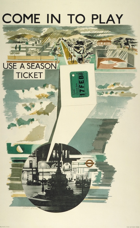
Painter Paul Nash also worked with London Transport to design posters in 1935 and 1936. He worked as a war artist in the First and Second World Wars and has a mixture of surreal and semi-abstract landscape paintings in public collections around the UK. His muted colour palette and textured washes of colour are instantly recognisable in his poster designs.
Piccadilly Extension
1932, poster by Edward McKnight Kauffer (1890–1954) 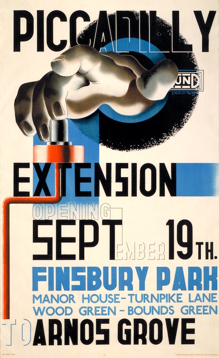
One artist who straddled the line between fine and commercial art was American artist Edward McKnight Kauffer, who is widely celebrated for his bold designs inspired by a mix of Futurism, Vorticism and Cubism.
'[Kauffer] started designing posters in 1915 and he carried on until the 1940s, when he went back to the USA,' says Matt. 'Over that 25-year period, his poster designs ranged from decorative and idyllic scenes of Kew Gardens with bright pastel colours through to bold, modernist 1930s designs that emphasised the technology and electricity of the London Underground network.'
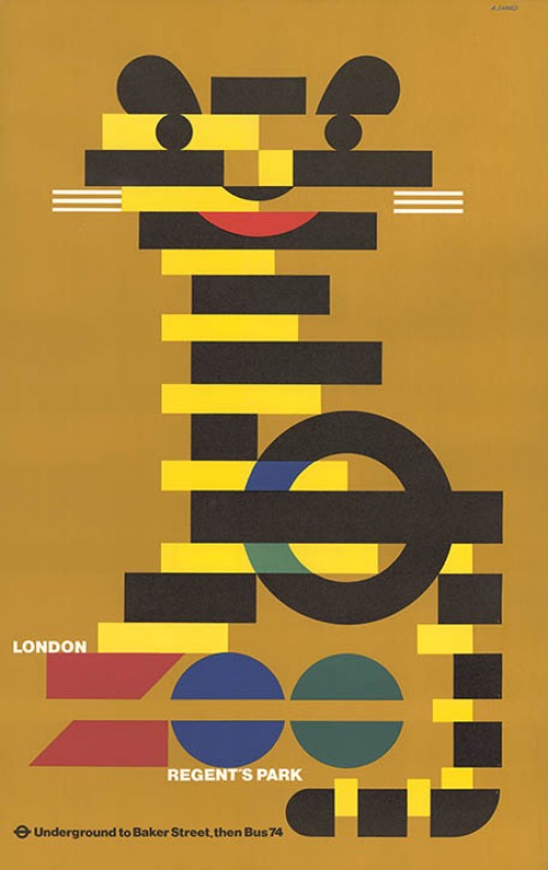
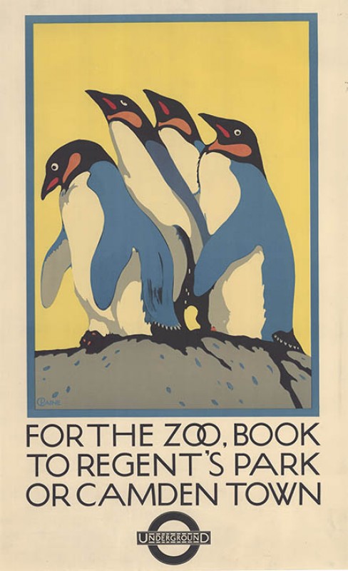
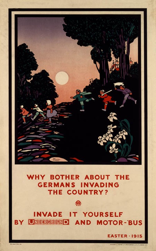
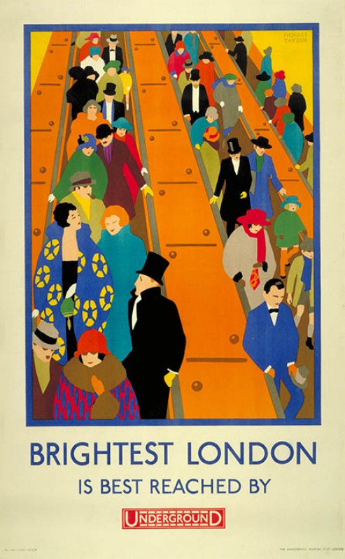
London Transport was one of the largest commissioners of these kinds of work at the time, and this is reflected in the variety of artists and styles in the poster collection. Looking at posters they commissioned for over the decades is an excellent way to observe how design trends have changed over time.
Listen to our other Art Matters podcast episodes
