Download and subscribe on Apple Podcasts, Stitcher or TuneIn
Art Matters is the podcast that brings together popular culture and art history, hosted by Ferren Gipson.
Whether we are listening to a podcast, reading a blog, or riding a bus, we are constantly inundated with ads. They are so commonplace that unless an advertisement is particularly good, we may barely register having seen or heard them. Behind each of the ads you love is a creative mind – or team of minds – that helped develop that idea. This episode will explore some of the artists who have worked within this space since the advent of modern advertising.
'Advertising is, itself, a product of modernity,' says Michele Bogart, Professor Emeritus of art history at Stony Brook University and author of Artists, Advertising, and the Borders of Art. 'The modern type of ads, which rely on bold graphic images and a limited amount of text ... [is] pretty much a product of the 1890s.'
From this period, we begin to see more small advertisements in newspapers and magazines, and large illustrated posters become more common. Often the poster ads are for the theatre or other forms of entertainment, and print magazines would contain ads for products. Stylistically, they are inspired by a variant of the ornate Art Nouveau style.
Job
1898, lithograph by Alphonse Mucha (1860–1939) 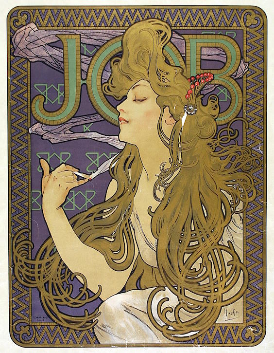
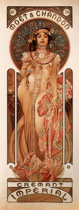
To get a good sense of the Art Nouveau style, you can look to the work of Czech artist Alphonse Mucha. He worked in Paris and is known for his ornate illustrations and commercial work. He took on a mixture of projects including posters for the theatre and product advertising. Some of his clients included Moët-Chandon champagne and Job cigarette papers. The designs often feature an image of a woman with her hair whipping about in a stylised fashion, surrounded by a decorative pattern or flowers. In the advertisement for Job cigarette papers, Mucha painted a figure smoking and depicted smoke snaking up the background towards the company's name. Mucha is often referred to as an 'illustrator' or 'graphic artist'. Currently, these labels may be used for artists who work commercially, but these sorts of distinctions from 'fine artists' would not necessarily have been made at the time.
As we have seen in past episodes on children's book illustrations and railway posters, some artists had mixed feelings about taking on commercial work. Some embraced these projects, while others tried to make clear distinctions between their fine art and commercial projects.
'Around 1910, as more and more illustrators start to get involved in this work and they ... start to get paid more, there arises this uneasiness,' says Michele. 'But they do it. Edward Hopper did advertising – it's just that he went out of his way to conceal that fact.'
Advertisement designed for the American Locomotive Company
1944 by Edward Hopper (1882–1967) 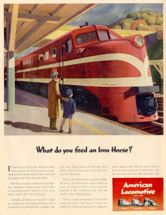
Hopper worked as an illustrator in the earlier stages of his career. He had been encouraged to study illustration by his parents, and it was this work that financially sustained him for nearly two decades. A piece he completed for the American Locomotive Company in 1944 shows a father and son standing on a platform as a large train sits on the tracks. It captures that mixture of modernity and isolation that Hopper mastered so well, and could easily sit alongside any of his paintings.
'Our lack of familiarity with that work is not just a function of what the artists were trying to hide. It's also a function of what historians of those artists' works chose to emphasise,' says Michele.
'Pineapple Bud' advertisement designed for Dole Pineapple
1939 by Georgia O'Keeffe (1887–1986) 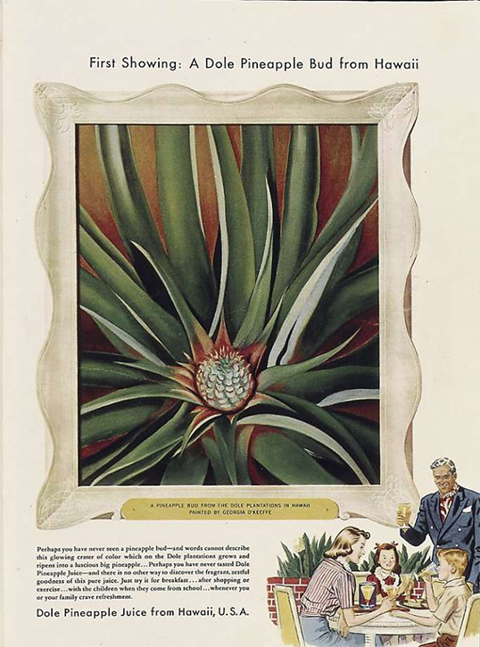
Georgia O'Keeffe was one of several artists to design ads for Dole Pineapple. The company paid for O'Keeffe to travel to Hawaii in exchange for her painting two pieces to use in their advertising. She spent a couple of months exploring the islands and produced one painting of a papaya tree and one of a crab claw plant. Dole was upset not to have a pineapple painting and sent O'Keeffe a plant to paint upon her return to New York. The images are the close-up view of plants for which O'Keeffe is best known and they were featured in ads in Vogue and The Saturday Evening Post.
Advertisement designed for the Container Corporation of America
1970 by René Magritte (1898–1967) 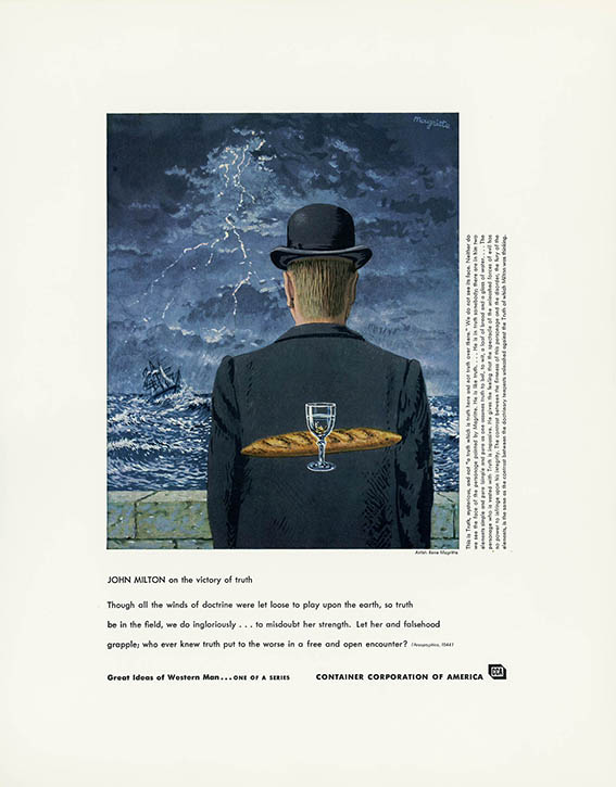
Into the 1960s, a forward-thinking company called the Container Corporation of America commissioned many artists, including René Magritte and Willem de Kooning, to paint images or create graphic designs for some of their advertisements for cardboard boxes. The types of products that solicited artist collaborations varied, but there was a perceived connection between quality and luxury to having an artist design a brand's ads. It is, perhaps, for this reason, that we see De Beers work with Picasso and Dalí.
Advertisement designed for Datsun
1972 by Salvador Dalí (1904–1989) 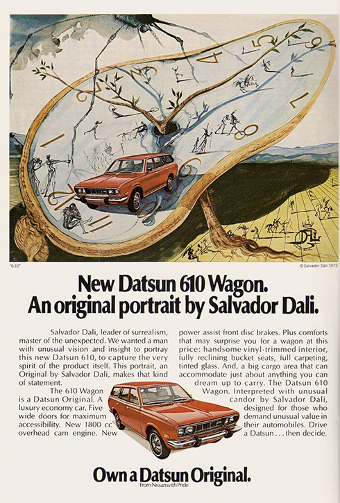
It is fun to search the web for old advertisements by these artists and, during my hunt, I came across an advertisement Dalí did for the car brand Datsun. It features a car atop one of the artist's signature melting clocks. A spindly spider descends on the scene from the top left and roughly sketched figures are dotted throughout the landscape. The text on the ad states the company wanted a man with 'unusual vision' to portray the car, and Datsun wasn't alone in this way of thinking.
'In general, the brands commissioned artists who were associated with fine art or who had a reputation as a fine artist for prestige,' says Michele. 'There was prestige and there was also a matter of grabbing people's attention. A lot of this gets going in the 1930s during the Great Depression when people weren't buying things and the companies wanted to maintain brand awareness.'
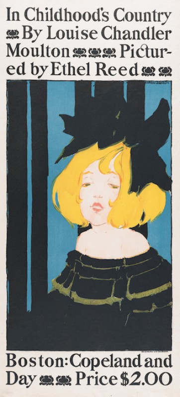
Jane Avril in the Entrance to the Moulin Rouge, Putting on her Gloves
c.1892
Henri de Toulouse-Lautrec (1864–1901) 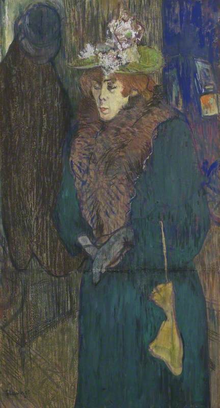
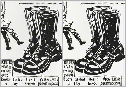
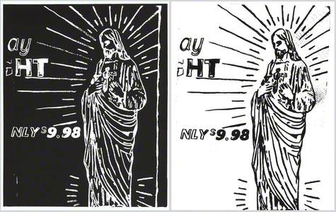
In a way, artists were lending their celebrity to brands via their ad designs. The use of celebrity in advertising certainly grows with the advent of television, but we can also observe this in early poster designs wherein artists like Henri de Toulouse-Lautrec prominently feature popular entertainers. As we move into the mid-twentieth century, the relationship between art and advertising was turned on its head when artists began to appropriate branding and ads into their work. This was explored, most notably, by the Pop artists.
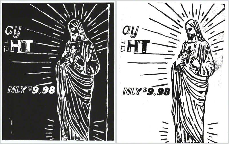
Throughout his career, Warhol created works that were inspired by small advertisements that could be found in the back of magazines and newspapers. His work featuring brands could also be viewed as a way of engaging with advertising, though he often featured products in isolation. After movements like Dada and Pop Art, an artistic approach encompassing various forms of visual culture has become more commonplace. It will be interesting to watch how this continues to shape the way historians and the commercial art market approach the commercial projects of fine artists and celebrate the work of commercial illustrators more broadly.
Listen to our other Art Matters podcast episodes